The Aglow Laurel Inn

UX PROJECT: DESKTOP SITE
The Aglow Laurel Inn is a conceptual desktop website for a fictional boutique bed and breakfast located in Connecticut.

This site is designed to help users easily discover accommodations, amenities, and local experiences, while providing a clear and straightforward path to booking a stay.

Project Details

Problem Statement

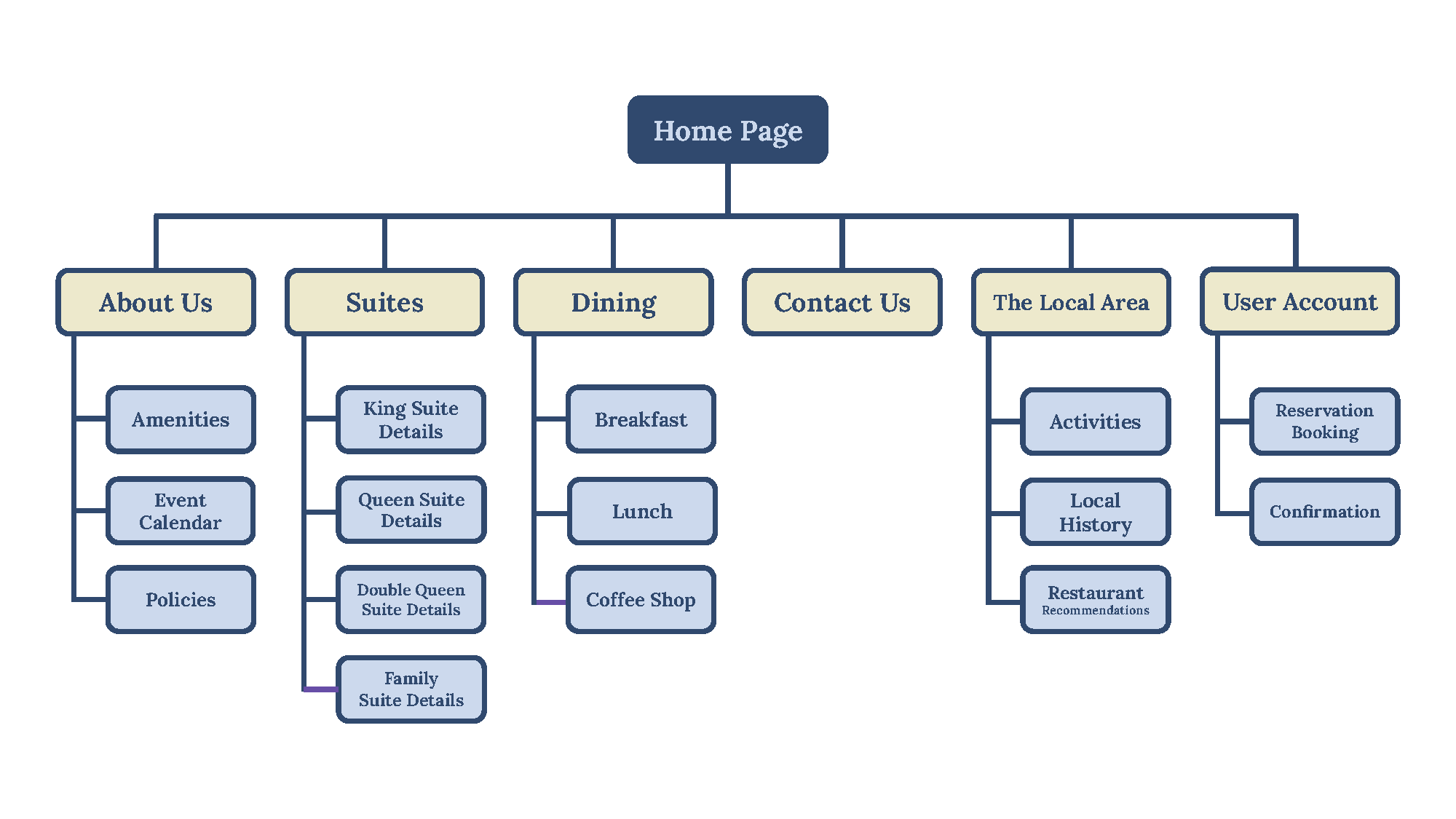
The Aglow Laurel Inn needs a website that supports a seamless reservation experience for users 18 years and older, and highlight the Inn’s features, modern aesthetic, and local attractions in a clear and engaging way.

Goals

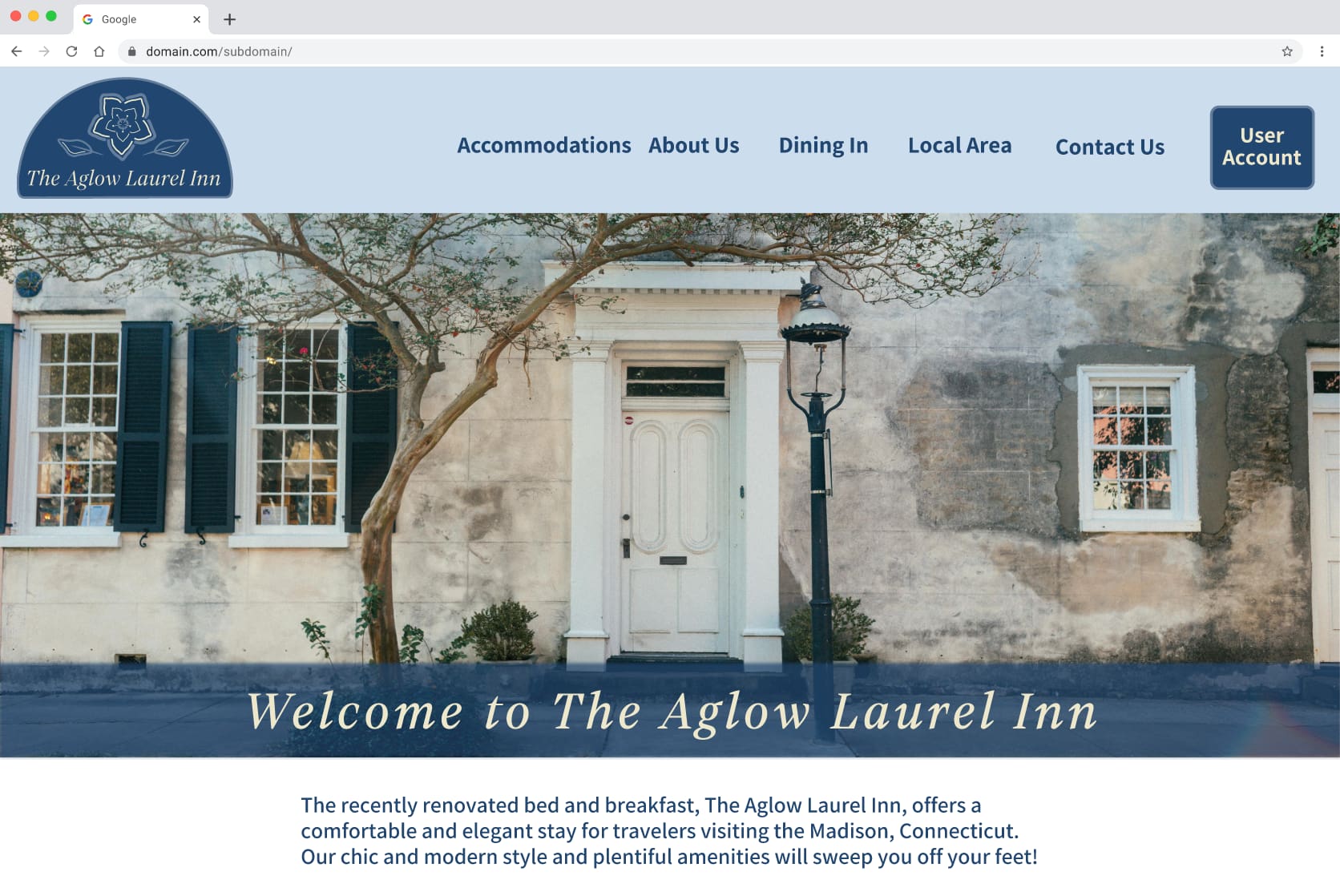
The site is designed to create a seamless reservation experience while highlighting The Aglow Laurel Inn’s beauty and distinct amenities.

Research Conducted

Competitive audit was completed on B&Bs and Inns located throughout Connecticut.

Research Findings

User Pain Points

Offering unique activities, events, and multiple meal options in a B&B atmosphere with new amenities were the most attractive to users in this target audience.

Also, having ample white space on each webpage, large text and buttons, easy-to-read fonts, and straightforward guidelines for B&B policies were important areas to the users.

• Outdated information
• Text is too small and difficult to read
Blurry photos
Unclear B&B rules

Target Audience

Primary:

  • Adults in their late 20s to 50s seeking a relaxing, design-forward getaway with a partner, friends, or family.

Secondary:

  • Older adults and retirees looking for a comfortable, easy-to-navigate stay while exploring a new area.

User Personas:

To determine more about what each user's behavior and needs could be on this fan site, user personas were created. View them below:
Persona 1Persona 2

Project Plan

Design a desktop website for The Aglow Laurel Inn that highlights its unique atmosphere, amenities, and nearby experiences, while making it easy for users to browse and confidently book their stay.

The Design Process

1. Sitemap

An overview of all the pages created for Mindful Support Space's website.

2. Wireframes

Here are a few wireframes that each represent one mobile site page. They outline placement of logo, navigational hamburger menu, welcome messages, photos, and textual information.
Home Page
About Us Page
Events Page
Guest Guidelines Page

3. Brand Identity Design

The fan site visually starts to get put together here! The raccoon logo and color scheme was determined based on what could be envisioned for team colors.

The rough, block typeface matches the sports' theme, too.

4. The First Prototype

Here is a glimpse of a couple of the website prototype's pages. Accessibility standards, such as readability, ample contrast, and ease of navigation, were considered.
Home Page
About Us Page
Events Page
Guest Guidelines Page

Testing & Revised Prototypes

Tests Conducted

While completing this project, I received peer critiques from classmates around my low-fidelity prototype's layout. I also conducted an unmoderated usability study that measured the ability to complete a user flow of booking a reservation.

Based on user feedback, respective changes were made to the prototype.

Key Insights from Peer Review

It was determined that the following aspects should be improved:

  • Reduce the amount of space in between sections of text and images.

Second Usability Test

This usability study determined how effective the fan events page was at displaying event information and how adequate the fan event proposal feature was. This study’s results impacted whether the layout of the fan events’ page. Furthermore, this study determined how efficient the fan event proposal form is and whether more details need to be collected for the event submission.

Second Usability Test's Results

Users successfully completed the fan event proposal form and felt that no further changes or additions were needed. However, there was feedback that the fan events' page was a bit mundane and didn't spark interest as much as other pages did. Suggestions made were to use different text colors to make the information pop!

Updates Made

1. Adding more space between footer links.

2. Creating an inline section versus an overlay for the new chat box.

3. Simplify the new chat box layout by removing profile photo and name.

4. Change text color, increase text thickness, and add highlight colors to the fan events' page to help make the page more enaging and enhance readability.

Future Considerations

  • Create a more modern navigational dropdown menu and buttons to make the site have a cutting-edge, sports feel.
  • Add more white space to further increase ease of reading the site.

Updates After User Testing

The Revised Prototype

Explore the latest iteration version!